Abstract art for the living room: how to choose the colour without getting it wrong
The most common mistake when buying a large abstract is choosing it by looking at the painting. You like it on screen, you hang it, and a week later something feels off without you being able to say what. It is nearly always the colour, and it could nearly always have been predicted in three minutes.
The rule is simple: the dominant colour of the painting must already exist in the room.
Where to take the colour from
Stand in the doorway of your living room and write down three colours that are already there:
1. The wood tone: the floor, the table, the sofa legs. Light oak, walnut, cherry, pine. After the walls it is the largest surface in the room, and nobody looks at it.
2. The textiles: sofa, cushions, rug, curtains.
3. Metal and living things: lamps, handles, photo frames, and the green of your plants.
The painting must repeat at least one of those three. Repeating is not matching: if your floor is honey oak, a painting with ochres and sands picks it up even if the exact tone differs.
Then the second move, the one that makes a room look decorated rather than bought as a set: the painting should bring one colour that exists nowhere else, in small quantity. A red, a turquoise, a gold. Just a little. That is the accent.
If you know the 60-30-10 rule — 60 % base colour on walls, 30 % secondary in sofa and curtains, 10 % accent — the painting is the 10 %.
The three-minute test
1. Photograph the room with your phone, in daylight, no flash.
2. Convert it to black and white. If everything lands on the same mid grey, your room has no contrast: you need a painting with decisive blacks and whites. If contrast is already high (dark sofa, white wall, black wood), do the opposite: a tonal work of close values that calms things down.
3. Go back to the colour photo and find the tone that repeats most. That is the one that should appear in the painting.
It is a silly test and it works better than any colour theory.
Karla's colour families
Karla works in abstraction, and her catalogue groups fairly neatly into five families. Every work below has a 100 cm long side.
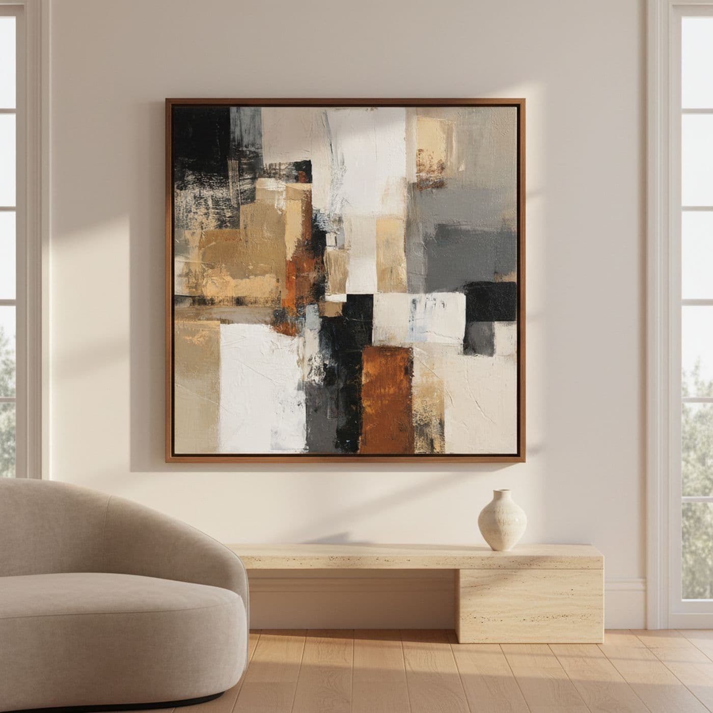
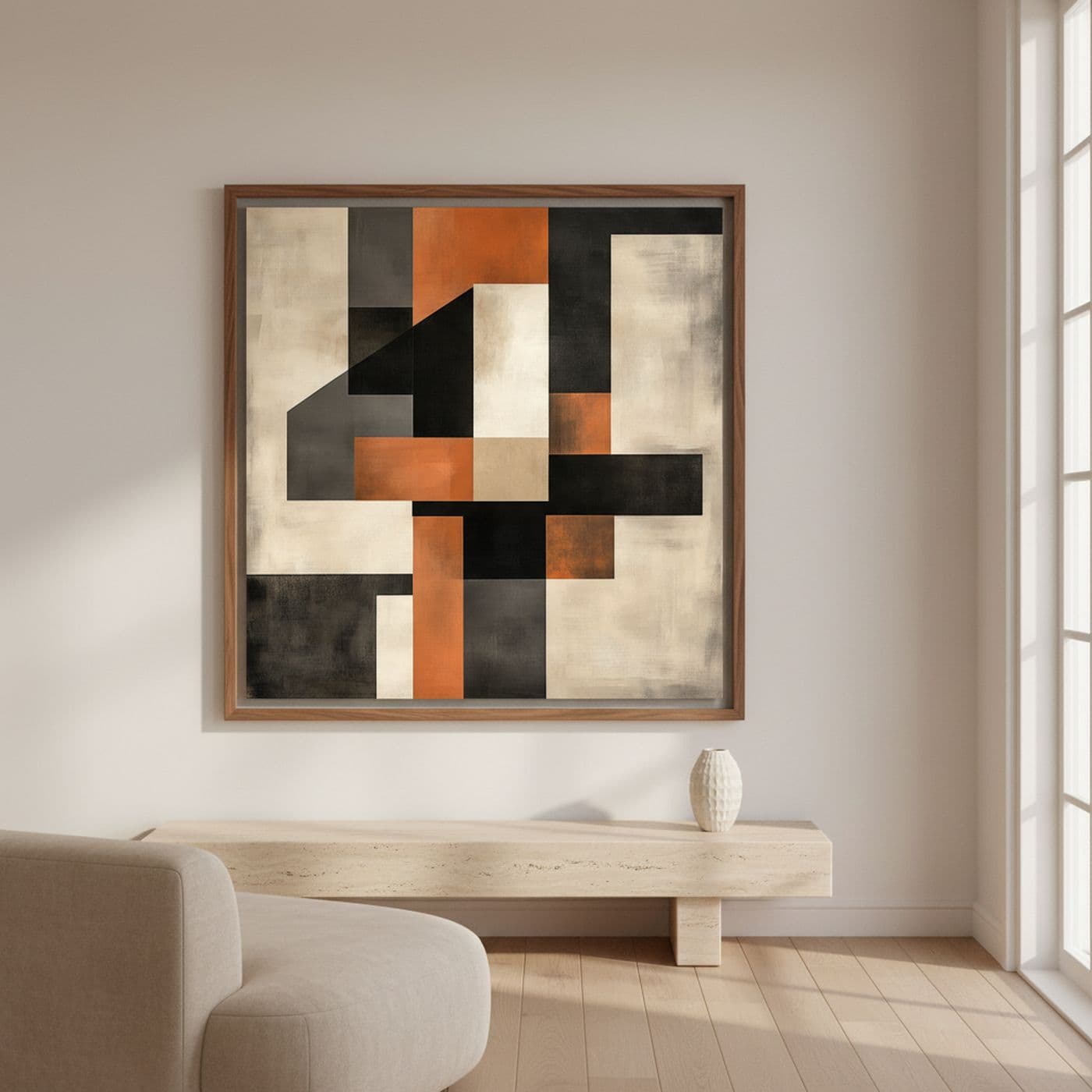
Earth, ochre and black. The easiest family to place. It works with warm woods — oak, walnut — beige, taupe or cognac leather sofas, and white or off-white walls.
- Tramas Urbanas de Ocre y Negro (100 x 100 cm): blocks of broken white, sand, burnt terracotta and black. The safest of all for a Nordic-style room.
- Bloques de Ébano y Ocre (100 x 100 cm): large geometry in toasted orange over raw white and charcoal. It needs a plain, light wall to breathe.
- Diálogo de Bloques Terracota (100 x 100 cm): rust red, golden ochre and cement greys. Perfect if the house has terracotta, leather or wicker.
- Texturas Ocre y Viento (100 x 100 cm): half the canvas is a plane of saffron orange. The boldest of the family; in a very white room it takes command.
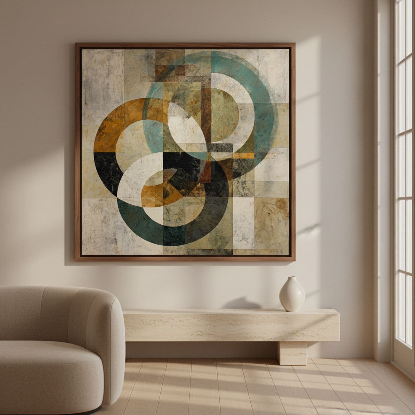
Blue-greens and greys. For cool rooms, with white walls, pale or black furniture and little wood.
- Ecos de Turquesa y Tierra (100 x 100 cm): large circles in petrol green and ochre over a bone background. Serene, never shouts.
- Círculos de Arena y Geometrías (100 x 100 cm): petrol blue, mustard and one small red that acts as a spark.
- Ecos de Tierra y Marfil (100 x 100 cm): blue-grey, night blue, broken white and a brick red accent. If you have burgundy cushions or a red rug, this painting picks them up and suddenly the room makes sense.
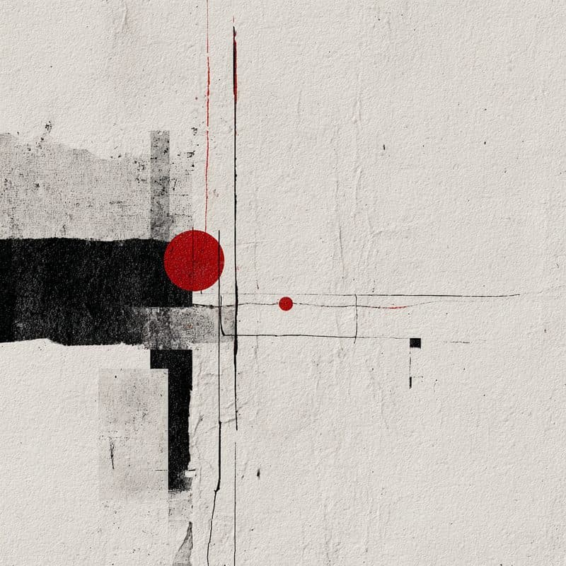
White, black and a dot of red. For minimal interiors, or rooms that are already full.
- Tensión y Equilibrio Carmesí (100 x 100 cm): a white plaster ground, one black block and two red circles. It is mostly air. When the room already carries a lot of information, this work rests the eye instead of adding noise.
Landscape oranges and greens. For when the room is correct but dull and needs temperature.
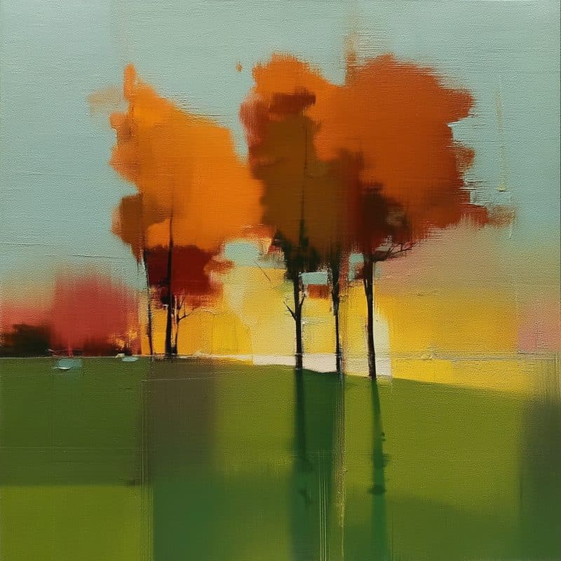
- Ecos Geométricos del Otoño (100 x 100 cm): orange treetops over a green field and a grey-green sky. Very luminous.
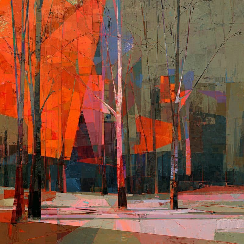
- Luz entre Ramas (100 x 100 cm): a fragmented forest in fire orange, sage grey and cold blues. More energy than the previous one.
Full colour. For large rooms, or an accent wall that takes the lead.
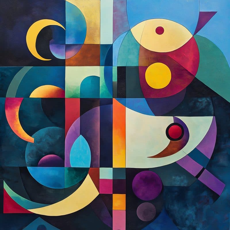
- Armonía Geométrica Vibrante (100 x 100 cm): night blue, yellow, magenta and violet in curved shapes.
- Caballos Cubistas en Metrópolis (100 x 75 cm): white horses reassembled over a city of colour.
- Pulso Urbano Neón (100 x 100 cm): neon pink, cyan and yellow. Closer to pop than to a discreet living-room painting: if you hang it, leave the rest of that wall empty.
And gold, on its own. Abstracción Oro y Negro II (100 x 100 cm) plays with greys, blacks and gold; Espiral Dorada I (56 x 100 cm) adds blue and cream. Gold wants dark wood or black nearby; in an all-white, cool room it is left stranded.
Three checks before buying
The light. A north-facing room dulls earth tones into mud; there you want more contrast, or the orange family. A very sunny room takes almost anything, but watch reflections if the piece has glass. A box frame has none, so that problem disappears.
The wall. A strong-coloured wall plus a strong-coloured painting is a fight nobody wins. Over white, off-white or light grey, everything fits.
The viewing distance. A finely textured abstract like Círculos de Arena y Geometrías is enjoyed from a metre away. A large-block piece like Bloques de Ébano y Ocre reads from four metres. Look at how far you will actually sit from it and choose accordingly.
If you get it wrong
You have 14 days to return it. But with the black-and-white photo and the repeated-colour rule, getting it wrong is rare.
You can see the full catalogue, with the size and frame of each piece, in reproductions. Every work arrives framed in an American box frame, ready to hang, for 299 € with shipping included; on 1 October the price goes to 350 €.
KARLMA
Grego & Raúl Rodríguez
Featured works
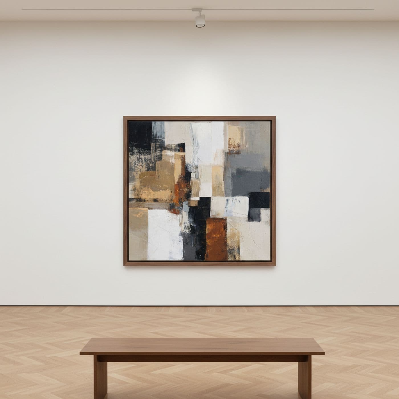
Tramas Urbanas de Ocre y Negro
Karla Rodríguez
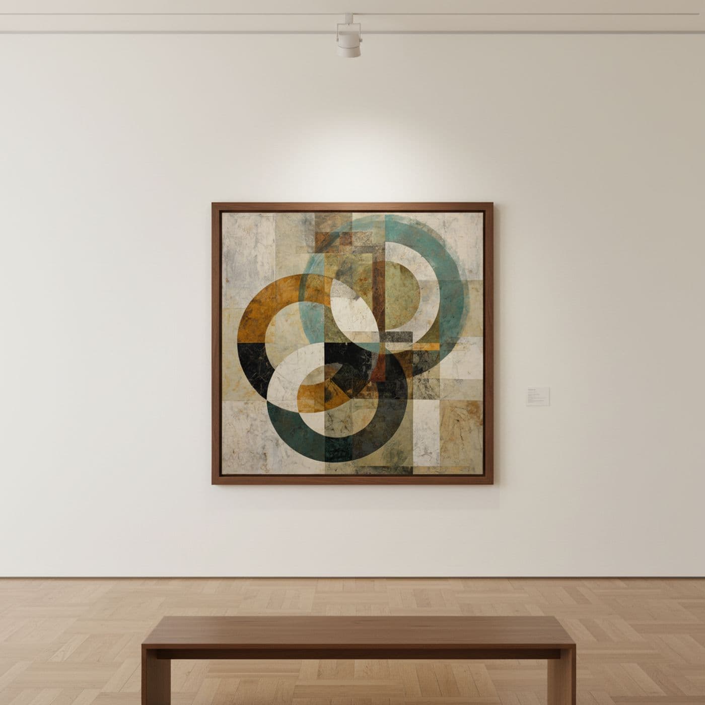
Ecos de Turquesa y Tierra
Karla Rodríguez
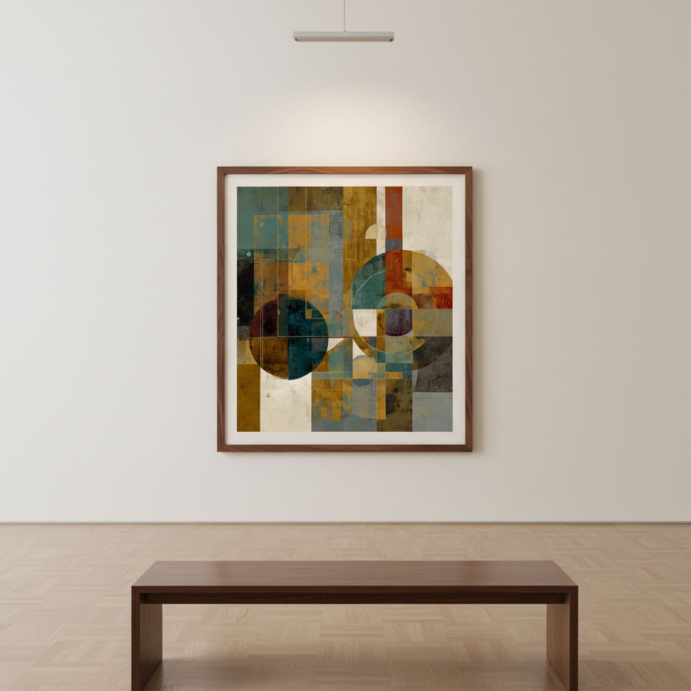
Círculos de Arena y Geometrías
Karla Rodríguez
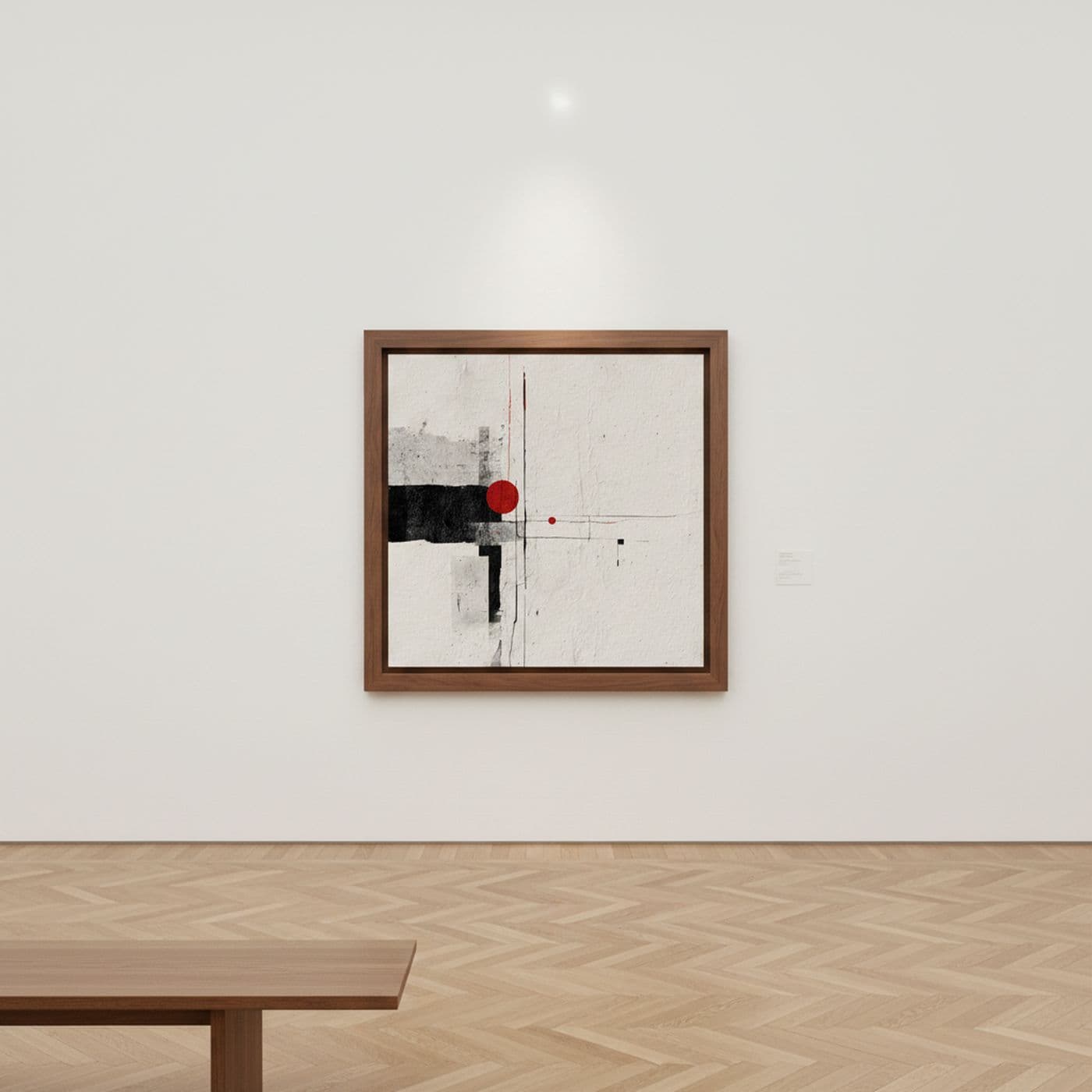
Tensión y Equilibrio Carmesí
Karla Rodríguez
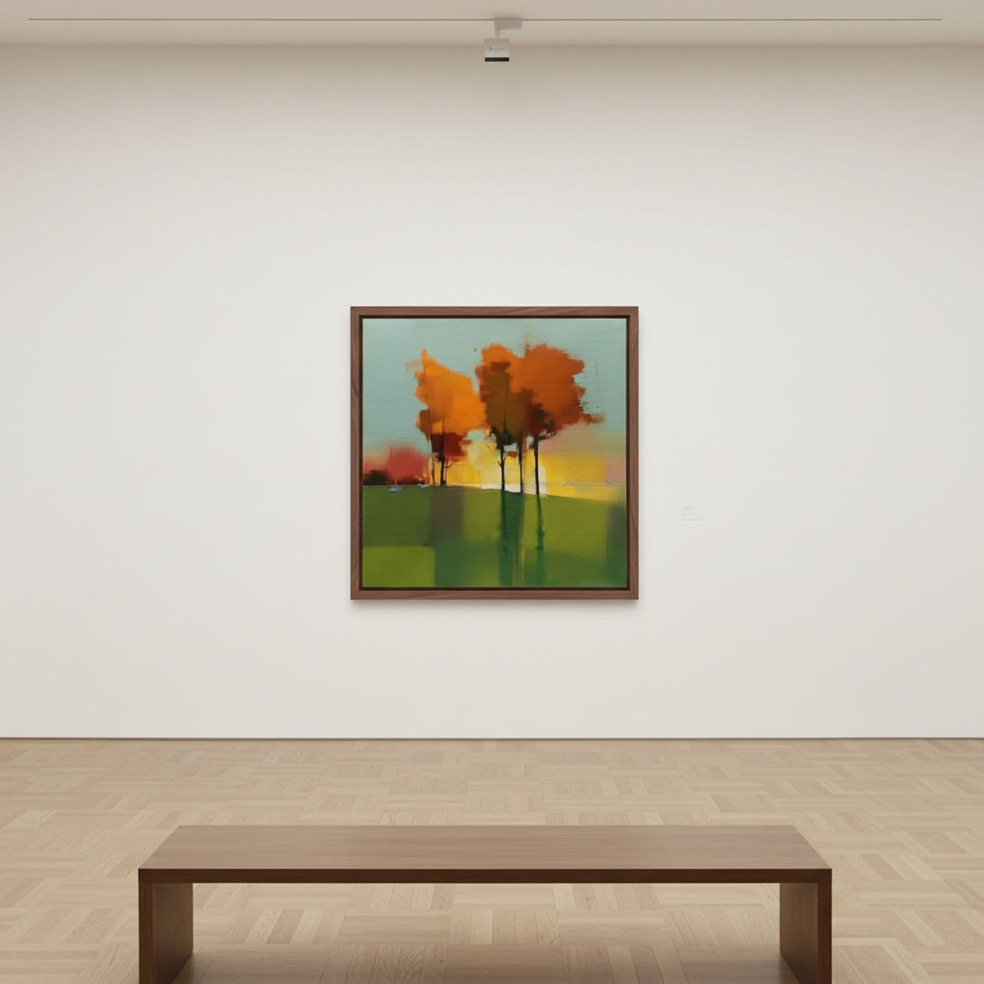
Ecos Geométricos del Otoño
Karla Rodríguez
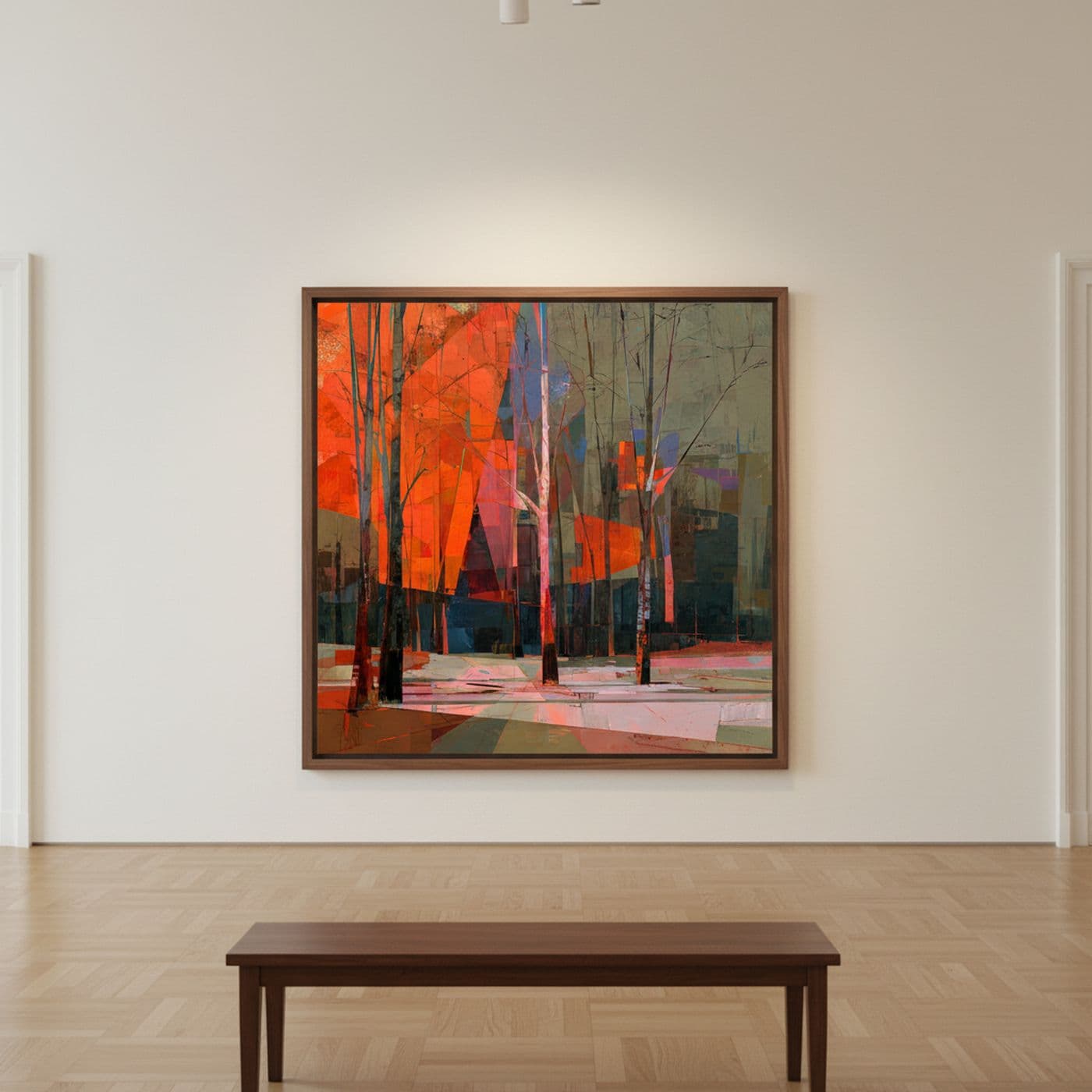
Luz entre Ramas
Karla Rodríguez
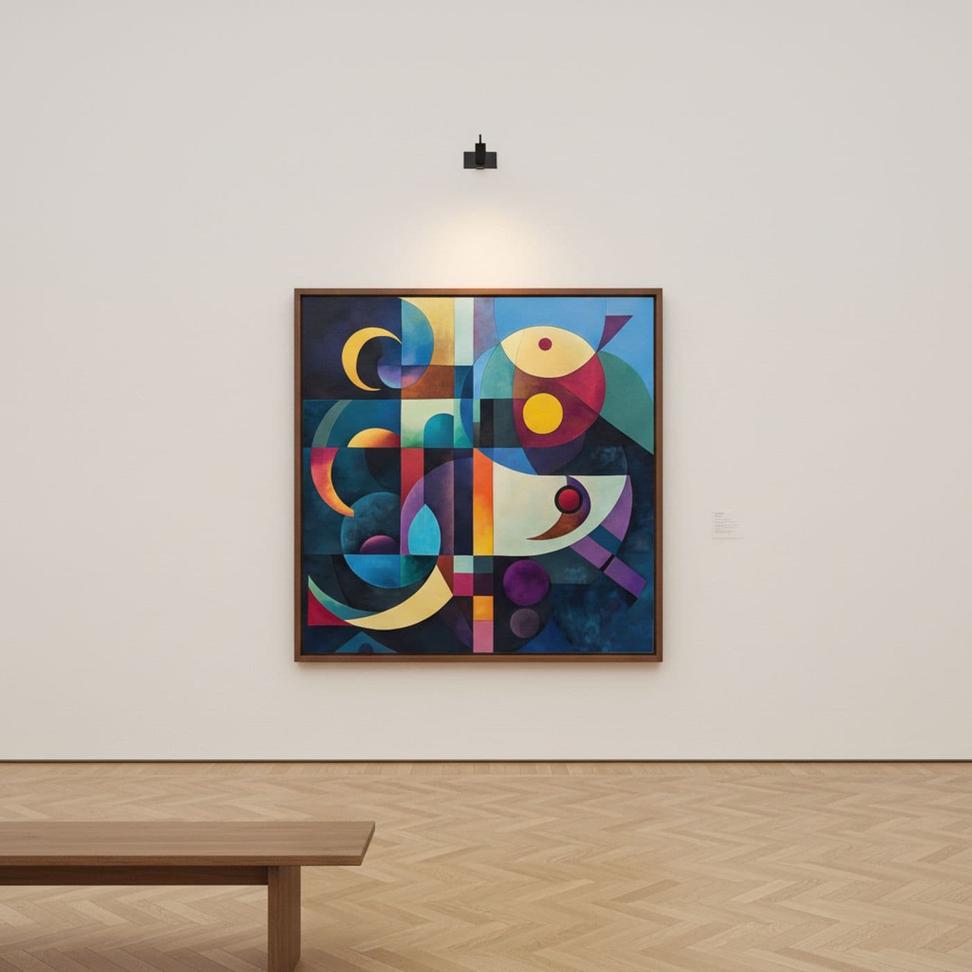
Armonía Geométrica Vibrante
Karla Rodríguez
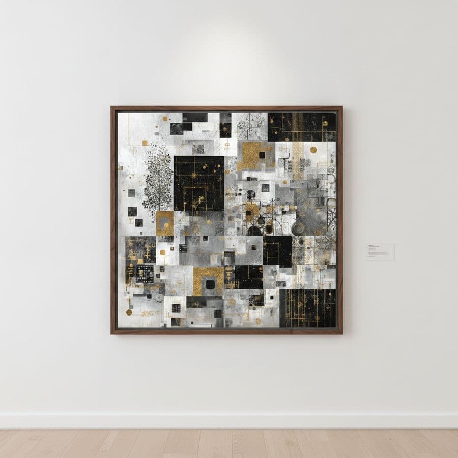
Abstracción Oro y Negro II
Karla Rodríguez